Latest Work
We put the story in Durham's history
01/02/2023
As an agency, we’re incredibly proud of our North East roots, so when we won a competitive pitch from Durham County Council to develop a new brand for the proposed history centre and register office at Mount Oswald, Durham we took it as an opportunity to position it as the beating cultural heart of the county and to play a meaningful role in people’s lives.
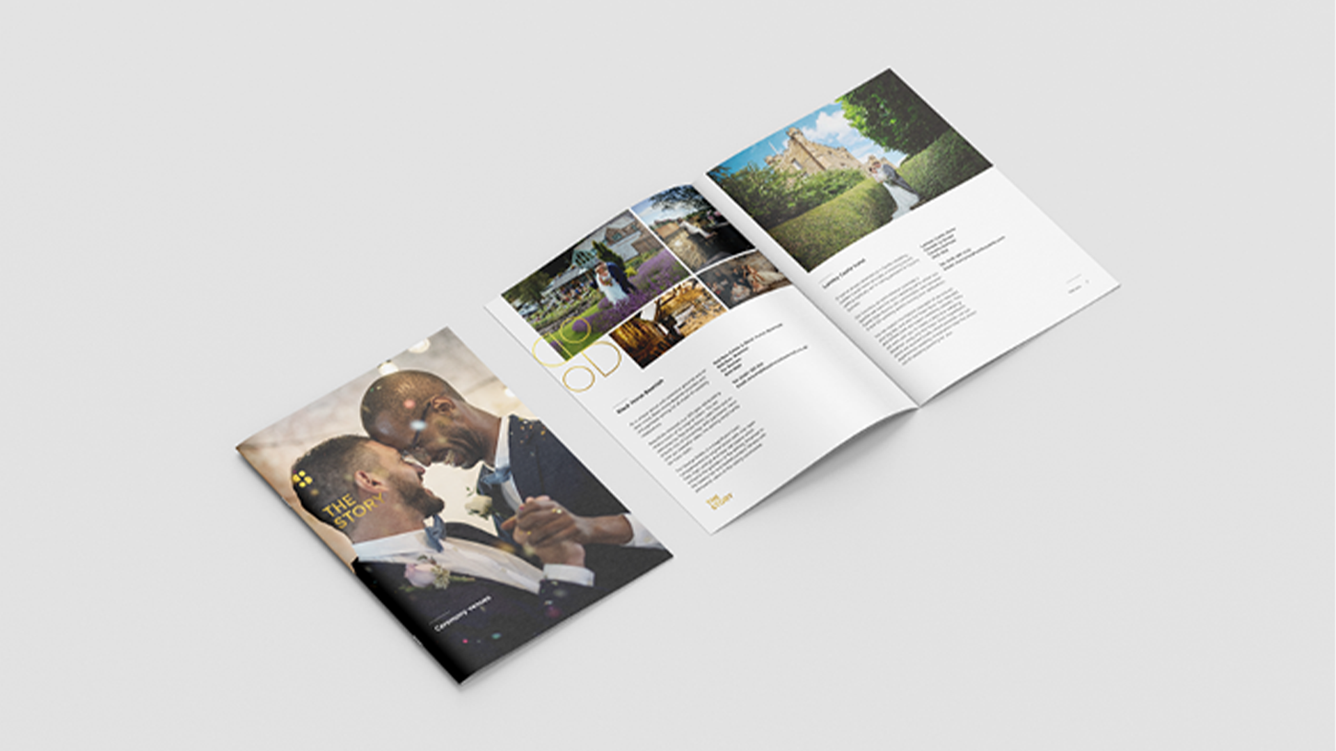
Our challenge was to develop a brand identity that was flexible enough to work across the many services being brought together, from registry services and weddings, public exhibitions and events, to military collection, archives, a café, and more. A brand that could play a role in the most joyful moments to the most solemn and build connections across many audiences.
Through our research, we found that our audience was proud of where they came from, but not everyone felt represented in the history of Durham, or felt that the history centre was a place to visit. This project will change that dynamic, showcasing the enormous but overlooked impact everyday citizens have had on this historic county, bringing these previously separate heritage collections together under one roof further amplifies that appeal.
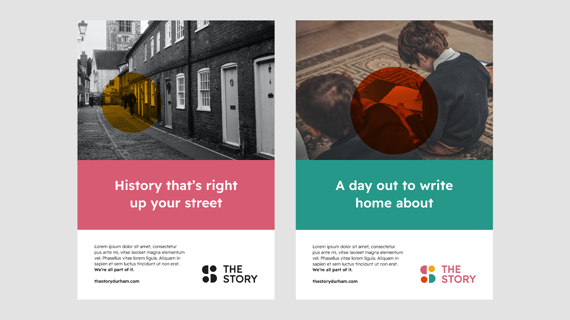
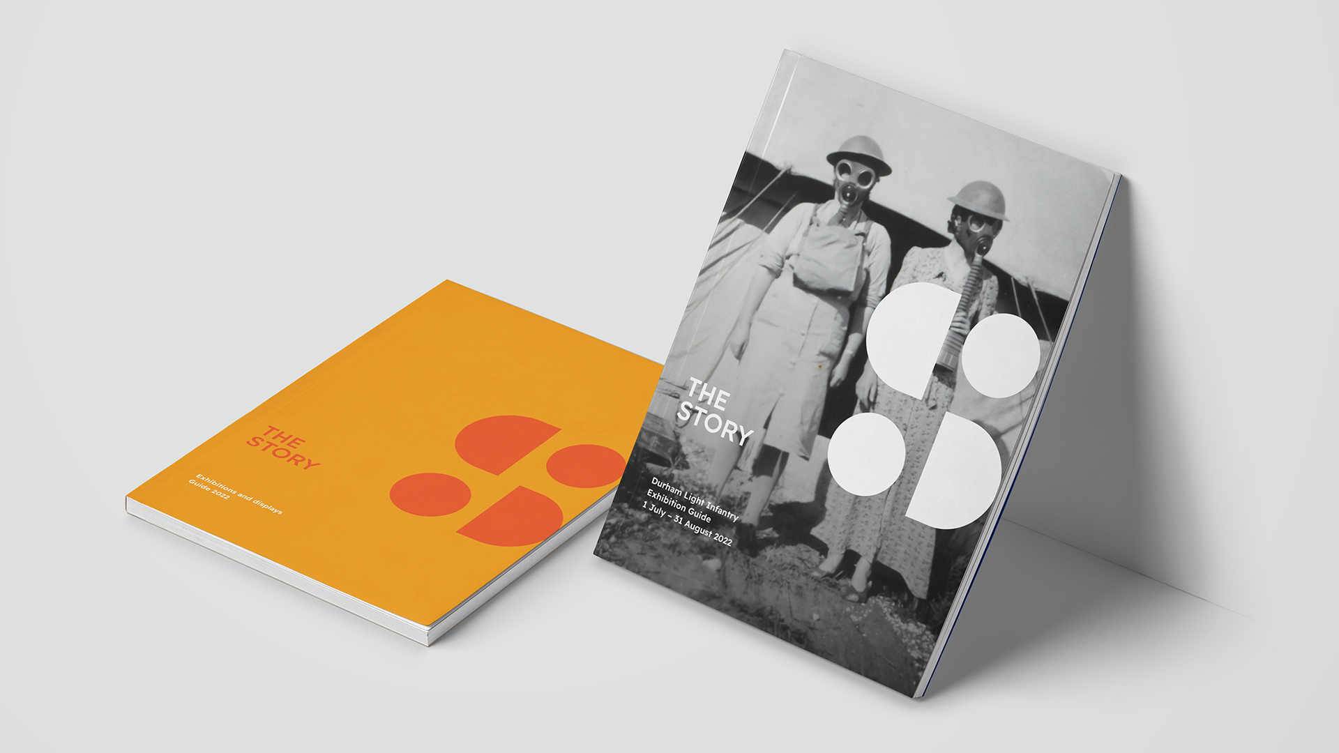
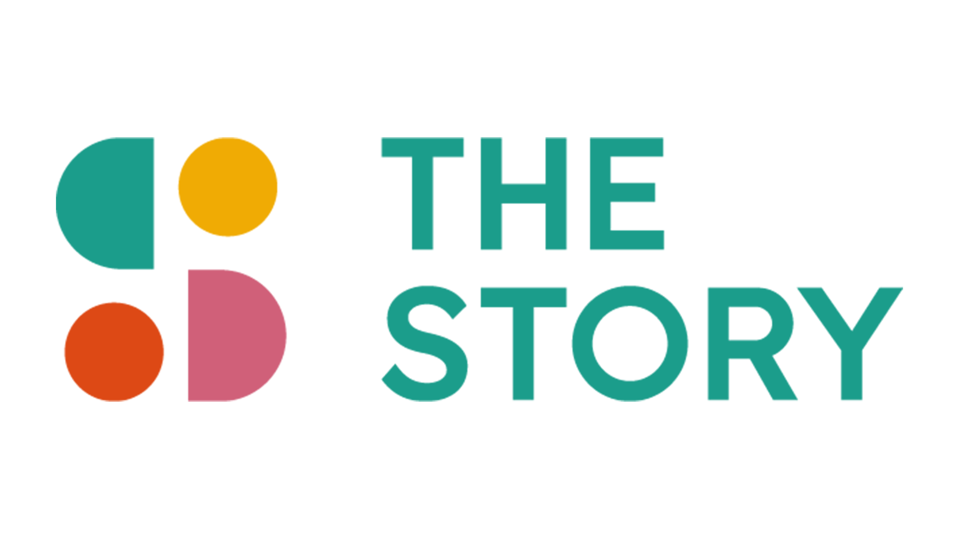
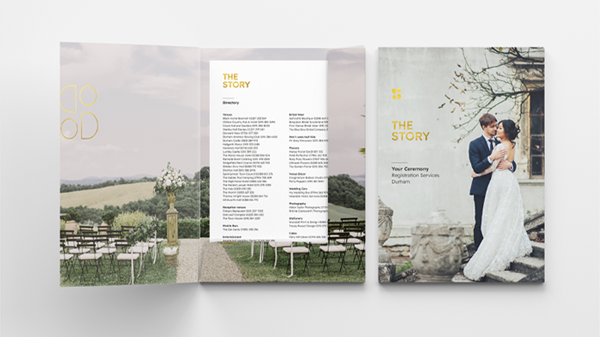
We conceived the name ‘The Story’ to demonstrate that the centre was a place to reflect on stories of the past, and create new stories, highlighting that we are all connected, creating one larger narrative. Supported by an emotive and inclusive strapline, "we're all part of it", the brand puts our audience at the heart of The Story, so they feel represented, understood and celebrated.
“When creating the brand mark, we started with the idea of a circle - the embodiment of an everlasting cycle representing birth, marriage and death; the past, the present and future. As The Story will play a role in so many parts of people’s lives, we felt this was the perfect symbology.
We needed to create something ownable and unique. When The Story is written in uppercase, the counter-space (the inside 'holes' of the letters) are a circle and a semi circle. Using these shapes, with a bit of creative licence, we were able to create a bold and graphic S as our icon – a union of several stories.” - Laura Payne, Senior Designer.
To create a brand that cultivates a rich tapestry of memories and heritage for Durham, as well as becoming a destination that will make many more special memories in the future, is something we are incredibly proud of, and can’t wait to visit when it opens later this year.